I served as a product designer for an app aimed to improve public transportation usage, where I transformed user research and competitor analyses into a tangible prototype through research synthesis and design iteration.
The result is an app that promotes public transportation usage through rewards and incentives, and along the way, a heavily involved design process that challenged me to consider and prioritize my stakeholders and users.
ROLE
PRODUCT DESIGNER
SKILLS
USER RESEARCH INTERACTION DESIGN FIGMA PROTOTYPING
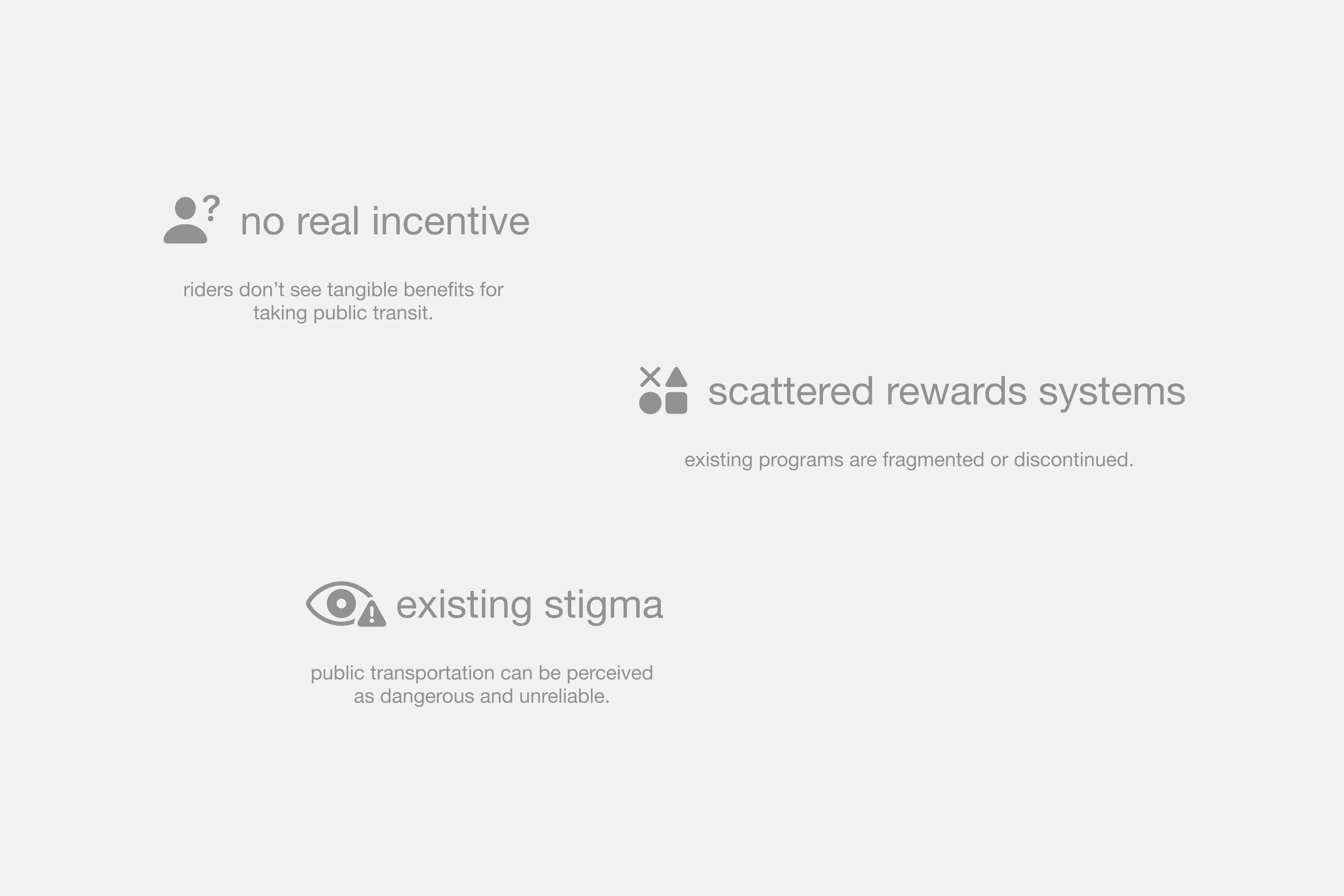
In Seattle, buses and light rail cover much of the city, yet many younger commuters still prefer to drive. While safety, cleanliness, and speed concerns remain, one major barrier is the lack of clear incentive to choose public transit over a car.
TrainTrek bridges this gap by rewarding riders for their trips. With points earned for every ride, a focused map of participating businesses, and easy QR code redemption, TrainTrek turns public transit into a rewarding habit.
CHALLENGE
Create a digital product / service that increases public transportation usage in the Seattle area.
SOLUTION
Your commute, rewarded
TrainTrek is a mobile app designed to encourage public transportation through rewards and incentives. By linking your transit card, you earn points for every ride, then redeem them for discounts at participating local businesses.
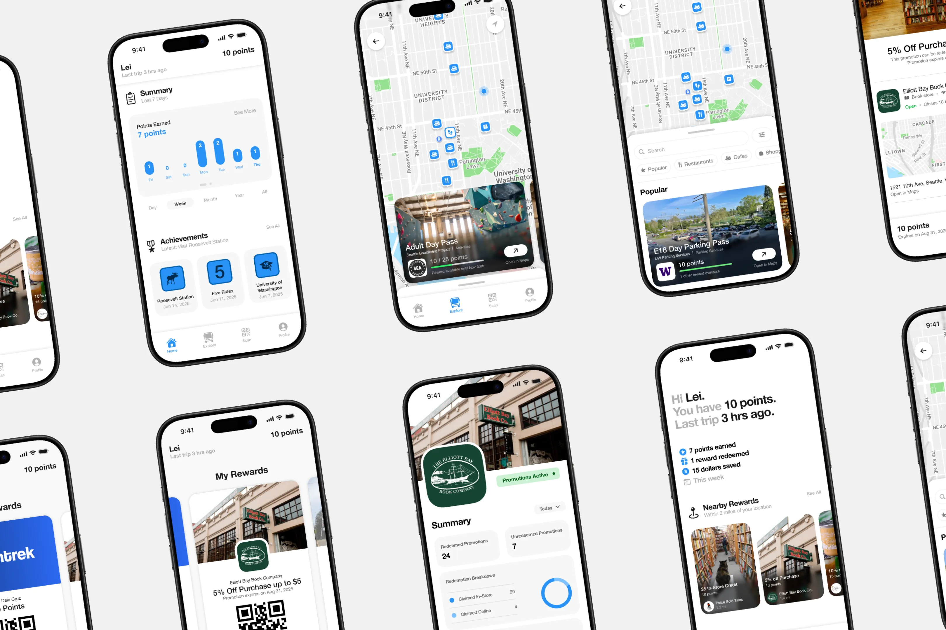
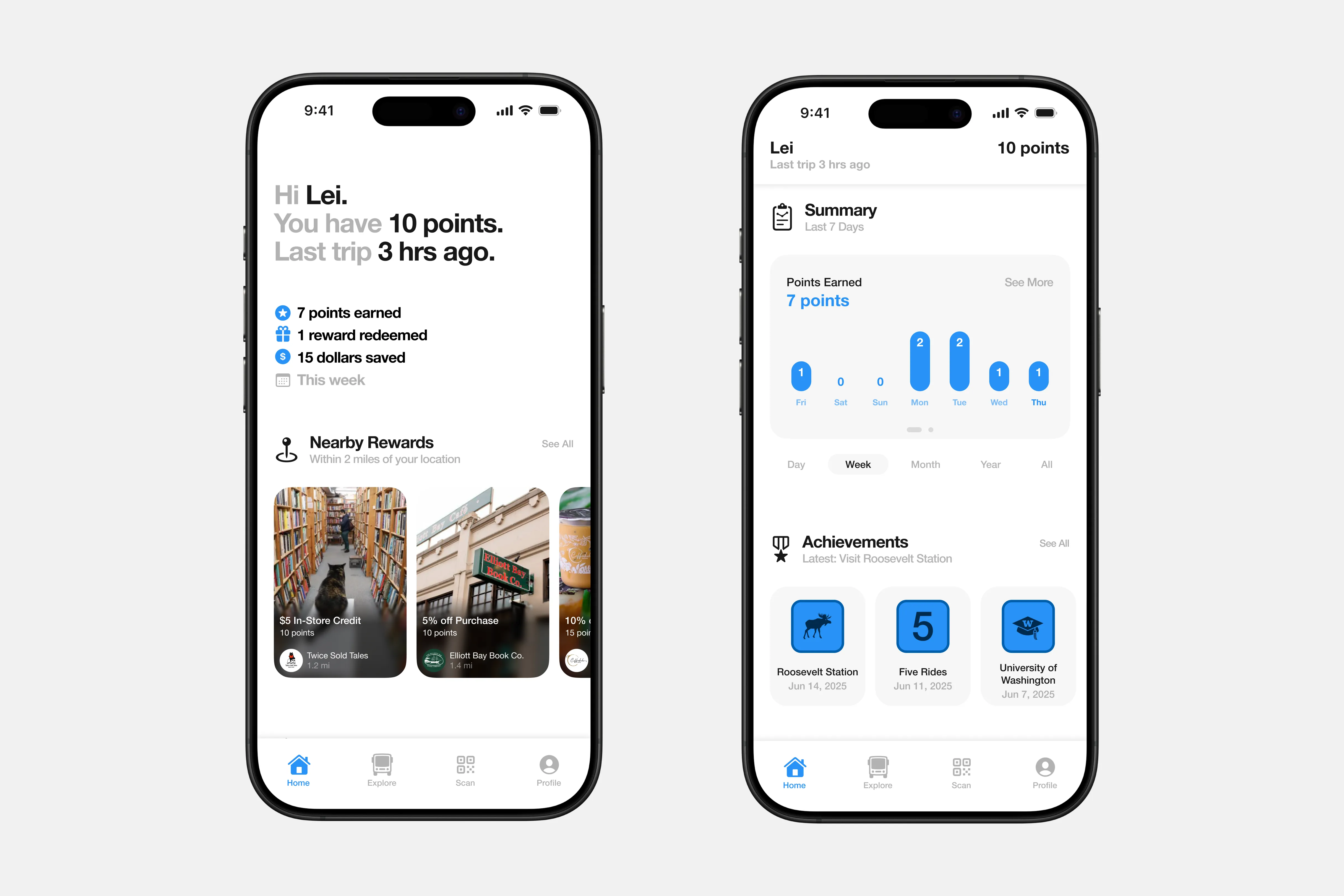
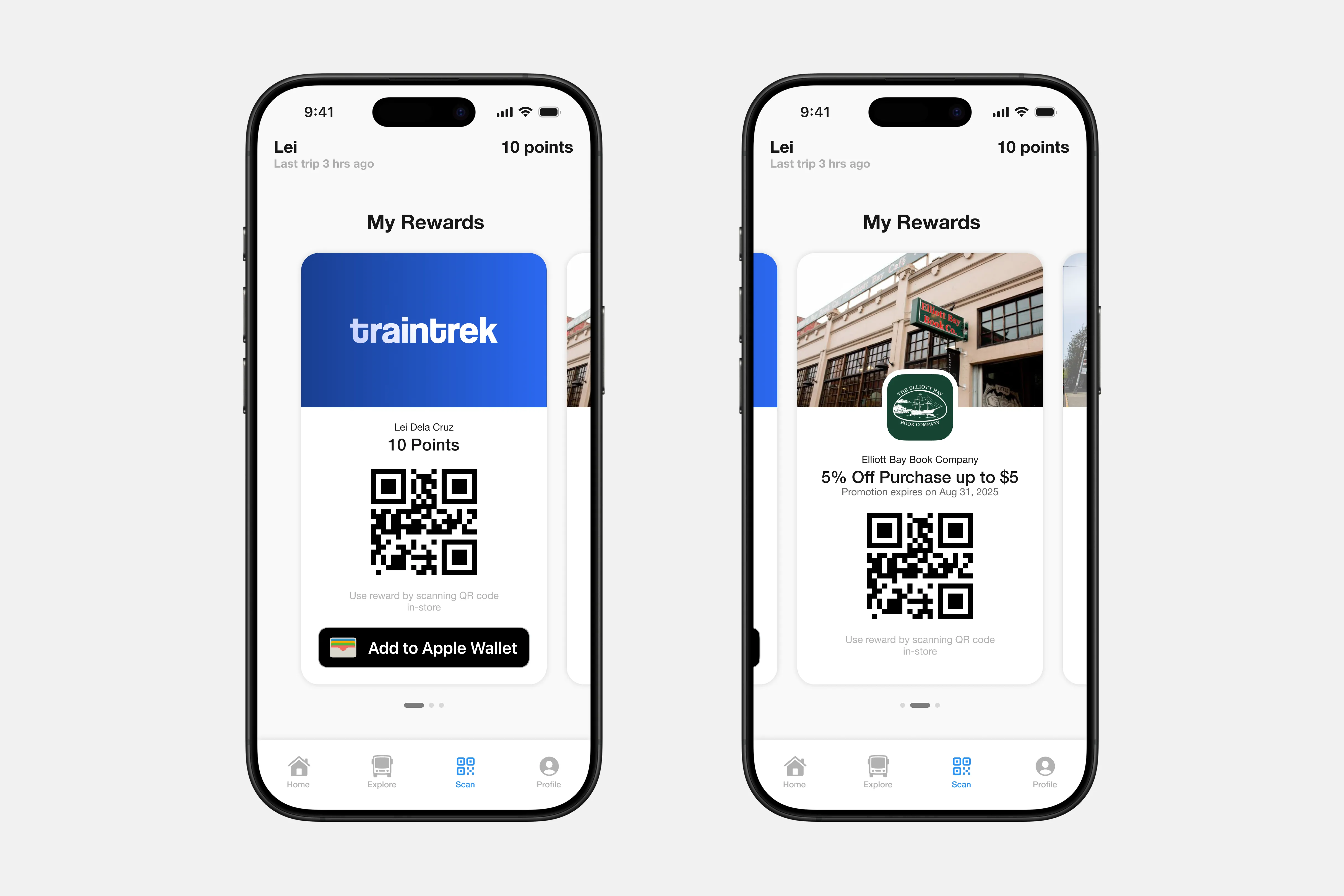
Overview, nearby rewards, summary, and achievement screens keep commuters updated with their point totals and their progress.
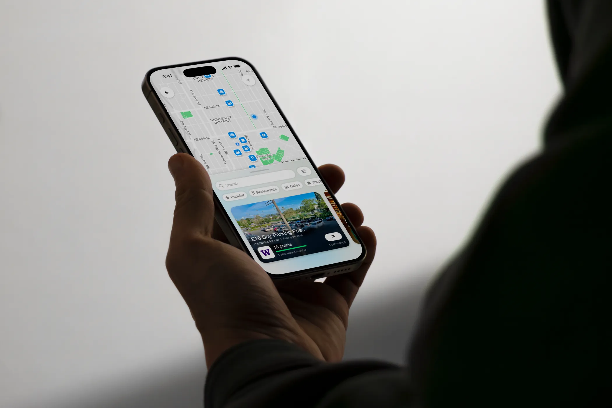
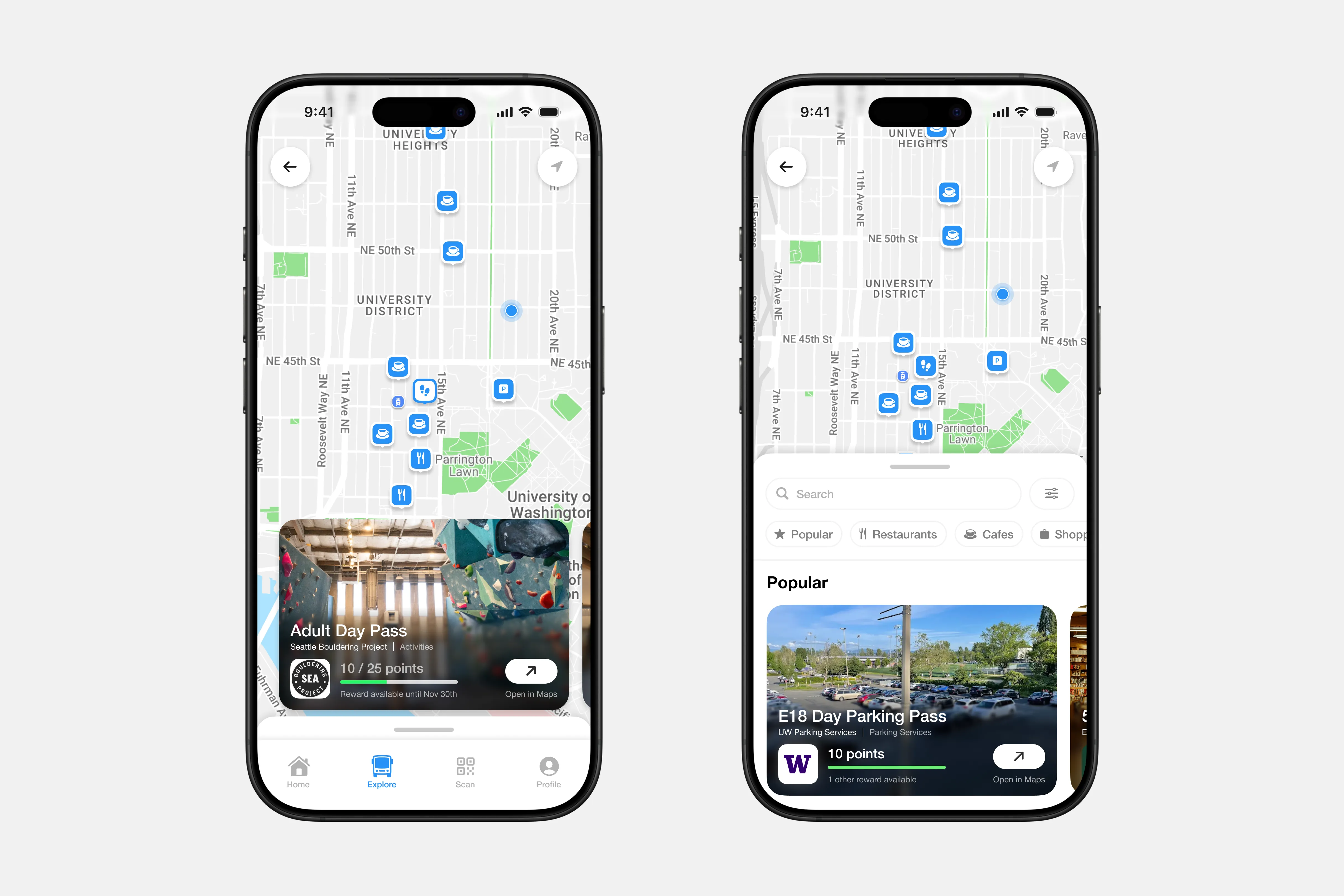
Users can browse for participating businesses to use their points at.
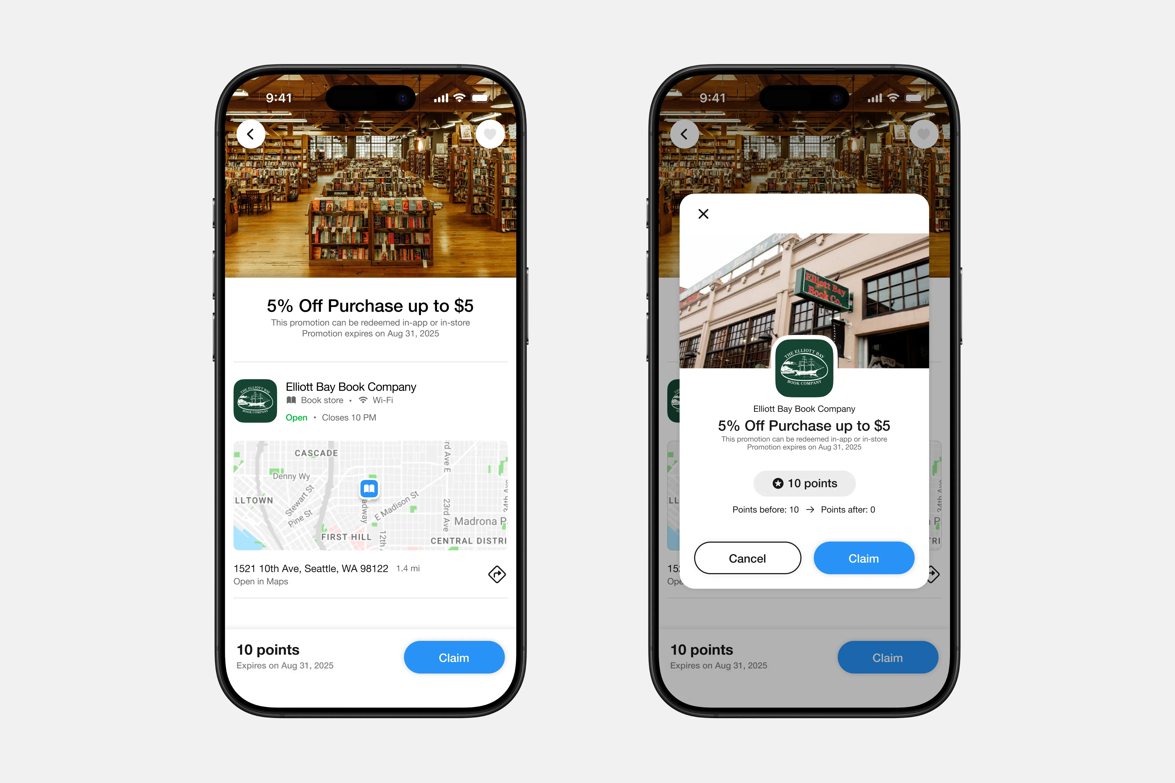
Promotion details, location, and necessary information are displayed on one easily scannable page.
Claimed promotions can be found in the scan page. TrainTrek also provides a personal wallet, so that commuters can use their points in person without needed to redeem a promotion in the app.
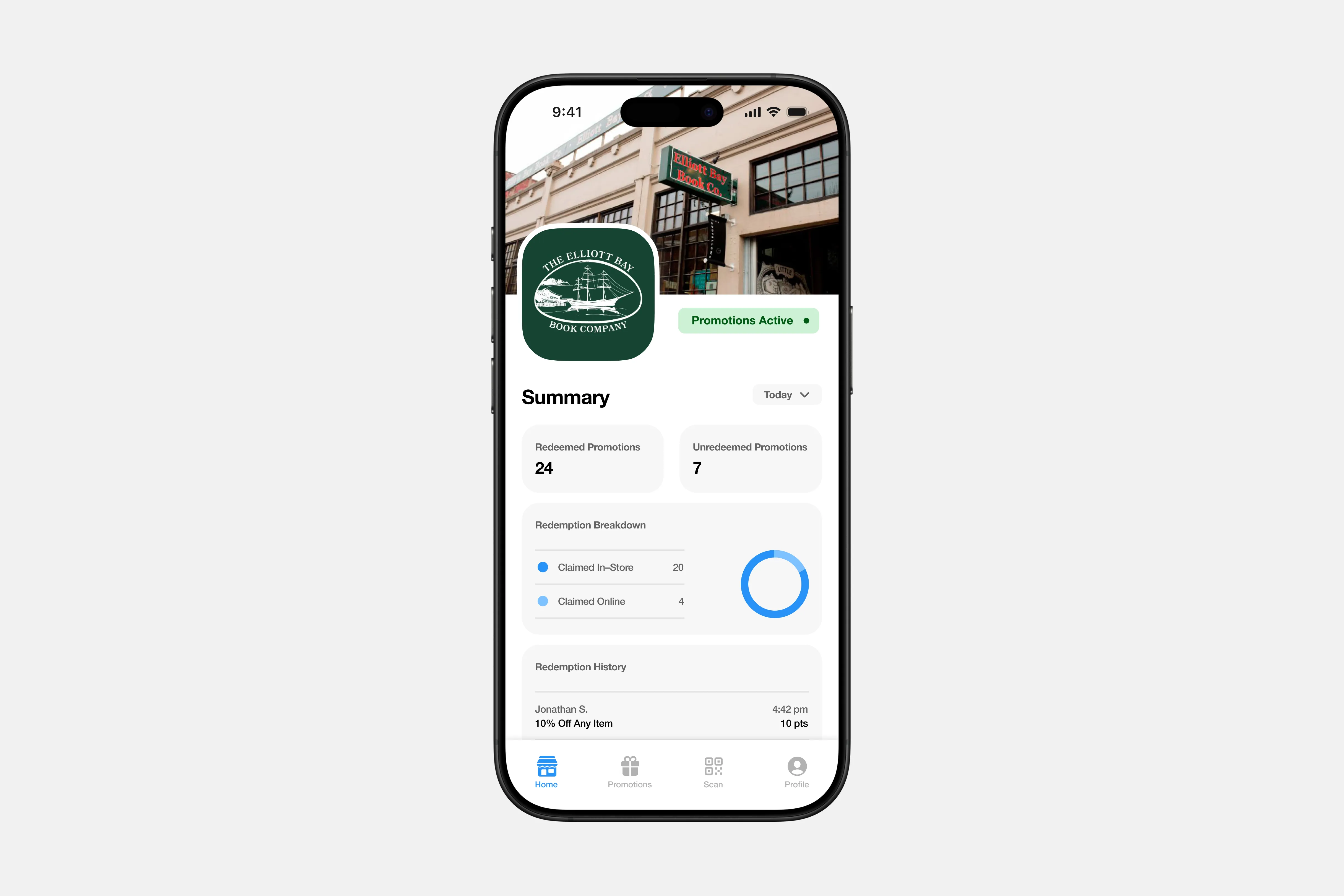
On the business-focused side of TrainTrek, businesses are given a summary of their promotion details and general information of their store.
USER RESEARCH
Understanding the problem
Through surveys and short 30 minute interviews, we uncovered key perceptions and insights:
COMPETITIVE ANALYSIS
What transportation apps are currently out there?
We conducted a competitor analysis comparing other common transportation and transportation-adjacent apps. We focused on how these apps promote transportation usage and leveraged the use of an interactive map.
INSIGHT
Commuting is more than just riding the bus
During our user research, we also found that many people, specifically students, haven't ventured much outside of campus throughout the several years they have been in college.
We wanted to improve public transportation ridership by invoking behavioral changes — that the bus wasn't just a mode of transport but a way to explore your city.
CHALLENGES
Our main factors to consider
HMW
How might we promote public transportation usage by making commuting more rewarding and attractive?
IDEATION
Figuring out our plan of attack
We visited and considered two ways to implement our idea. One idea focused on promoting the discovery of a city, and the other focused on promoting the businesses that would participate with the rewards program.
DESIGN
Exploring option 1
We decided to proceed with option 1. Our main concern with option 2 was its potential to be seen as a competitor to large apps such as Google Maps and Yelp, and unless we implemented everything they had and more, we were worried that we'd end up with a less successful product.
The explore page recommends the user with fun and popular Seattle destinations, and the estimated points earned if visited using transit. The rewards page displays a list of participating businesses offering discounts in exchange for points.
ROADBLOCK
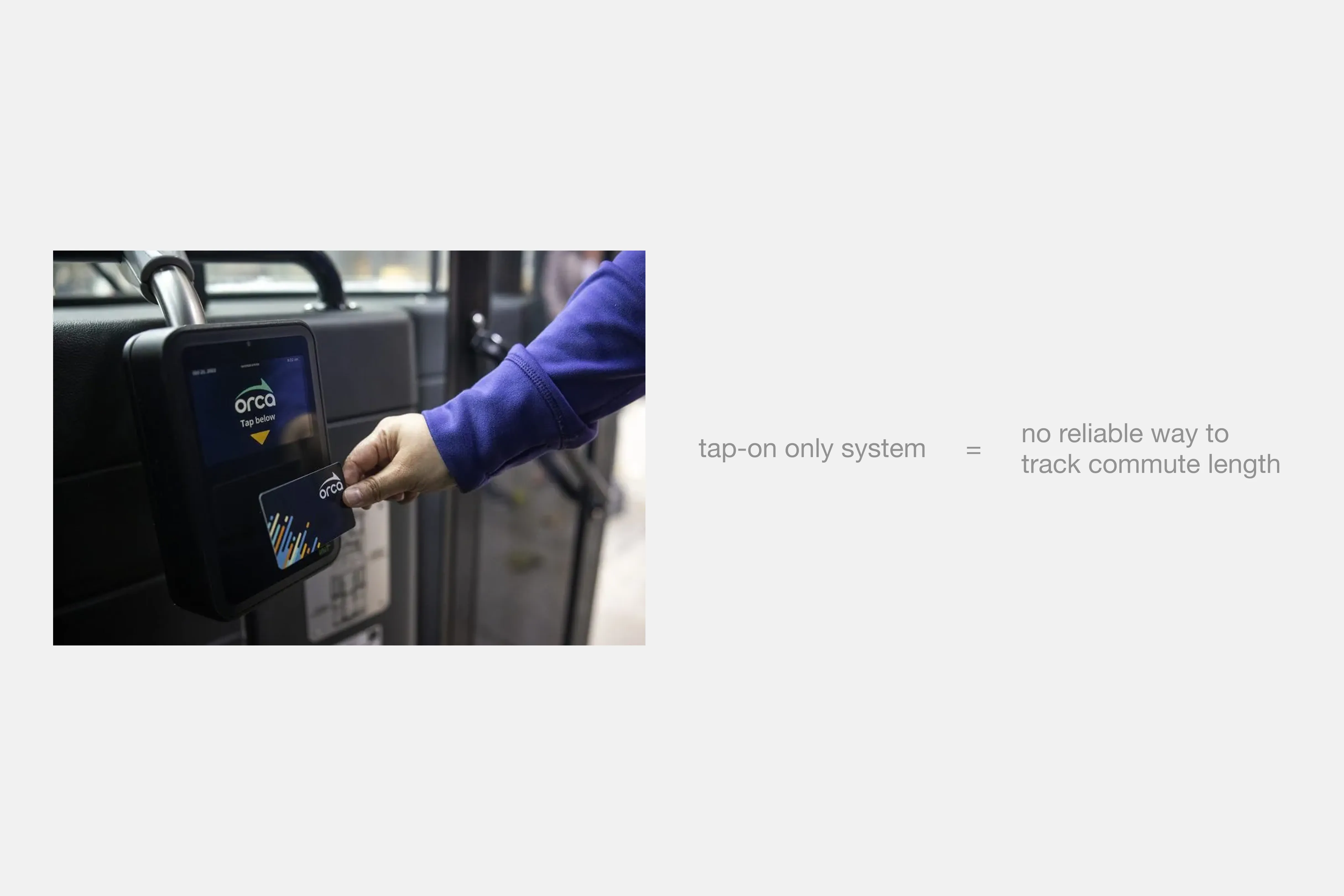
A fatal flaw we ignored
Partway through designing option 1, I realized one fatal flaw with this system. Seattle transit operates on a tap-on only system, meaning that there was no reliable way to keep track of a persons commute length. This meant that points had to be at a certain fixed amount of points per ride, making the explore page lose its value.
PIVOT
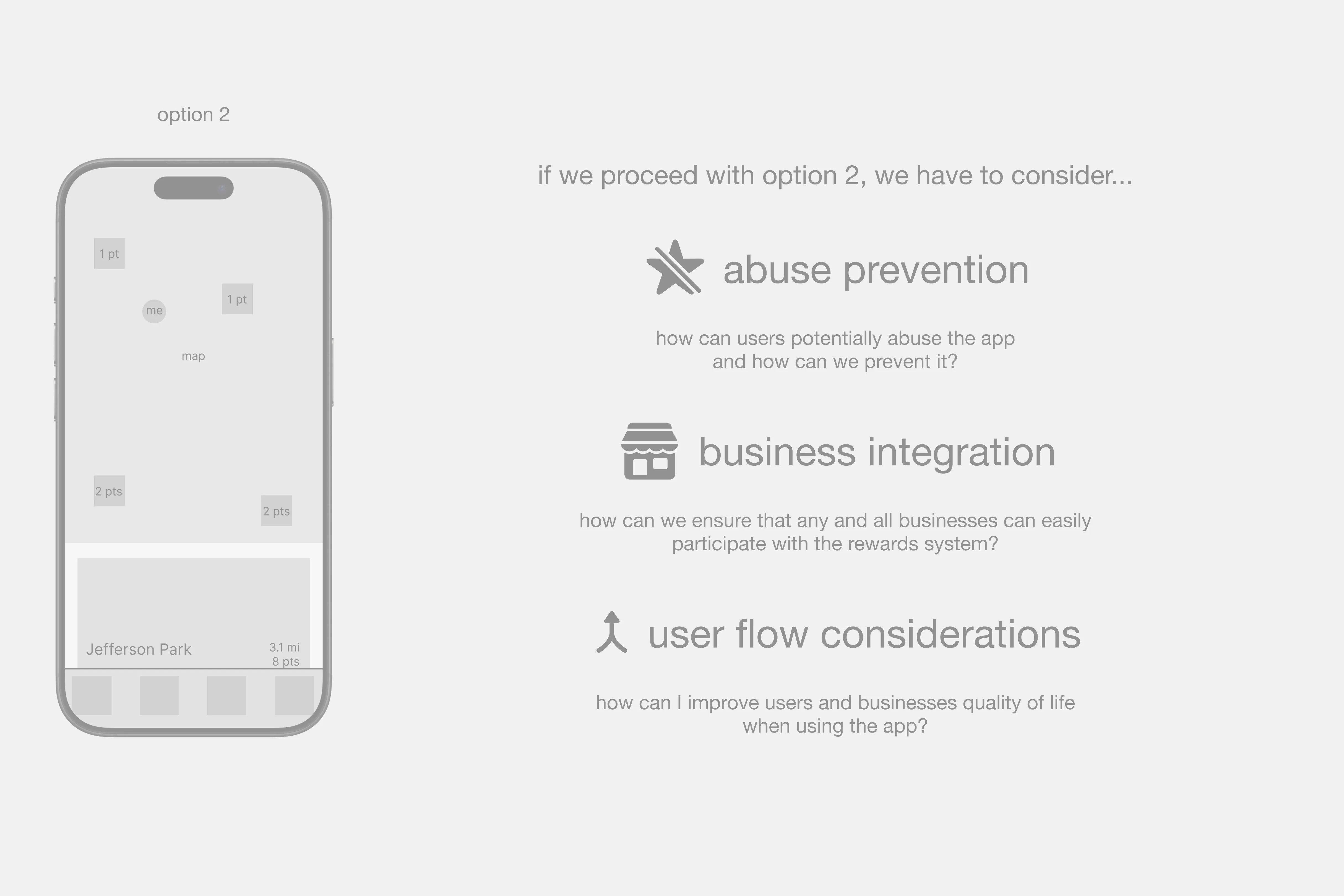
Pivoting to option 2
Having realized this, I decided to pivot the app to option 2: including a map, but this time refraining from providing details and fully focusing on participating businesses. With this, there were some things to consider when refocusing the final app around option 2:
Our main design challenges
FINAL DESIGN
Turning everyday transit rides into a rewarding habit
We put riders and businesses to the forefront of public transportation, encouraging the idea that taking public transportation is a habit that should rewarded and celebrated.
Home
Explore
Promotions
Wallet
Business Dashboard
REFLECTION
What TrainTrek taught me about design
This experience taught me that product design is not just about designing an experience, but understanding how it can fit into a larger ecosystem. I was constantly challenged to consider all the possible stakeholders of the app, from commuters, to small businesses, to users with malicious intent. I had fun iterating from a city discovery app where transportation was a second thought, to a focused reward system where PT was at the forefront.
.webp)
.webp)
.webp)
.webp)
.webp)