ROLE
PRODUCT DESIGNER
SKILLS
PROTOTYPING
VIBE-CODING
USER TESTING
TEAM
ME
TREYCE MEREDITH (MENTOR)
VICTORIA PEART (ENG PARTNER)
TIMELINE
SUMMER 2026
3 MONTHS
OVERVIEW
As a growth designer at Mercury, I used AI design tools and workflows to ideate and deliver new empty states, working closely with engineers to get both frontend and backend code shipped.
By the end of the internship, I shipped two empty state solutions, one currently live and one going through AB testing, seeing a positive 3% lift in treasury applications.
FINAL
My final deliverables redesigned the transactions page to a more activation-focused framing, using the space and early user experience to encourage eligible users to apply for a treasury account.
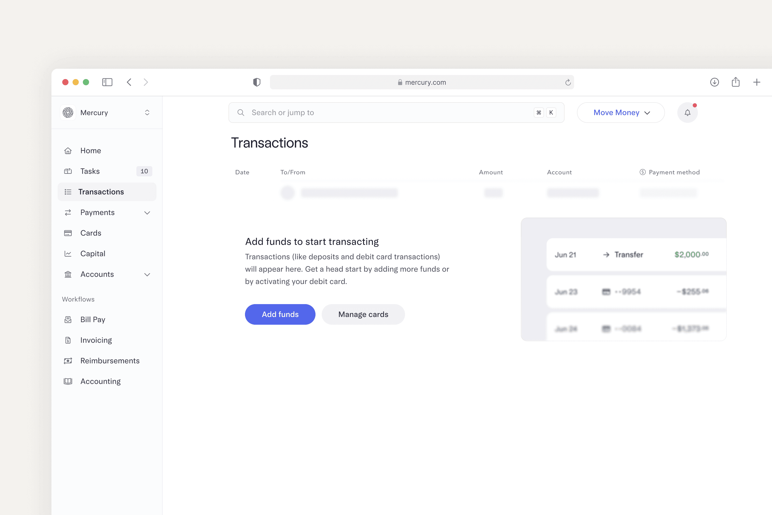
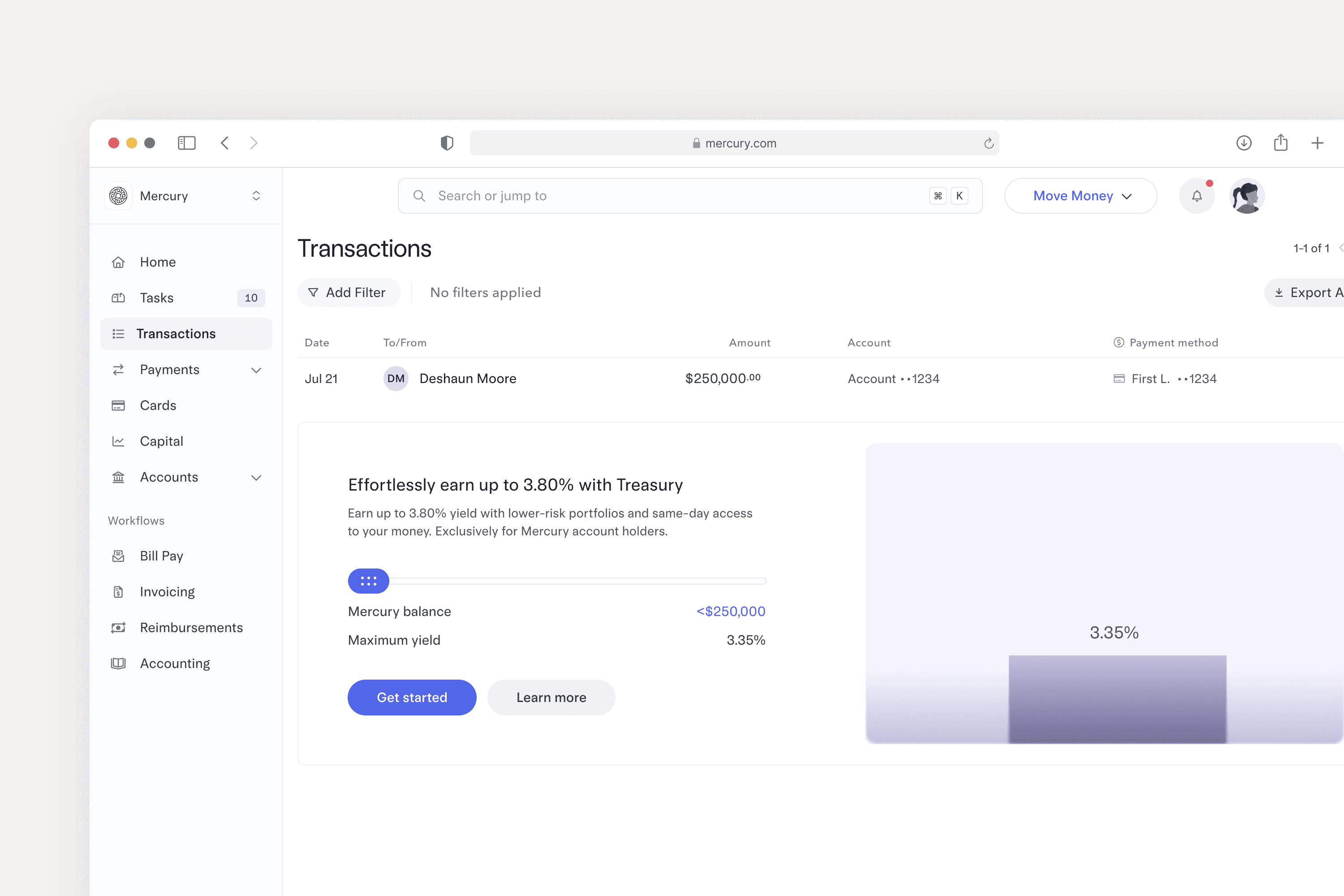
Complete and semi-empty states for the transactions page.
CHALLENGE
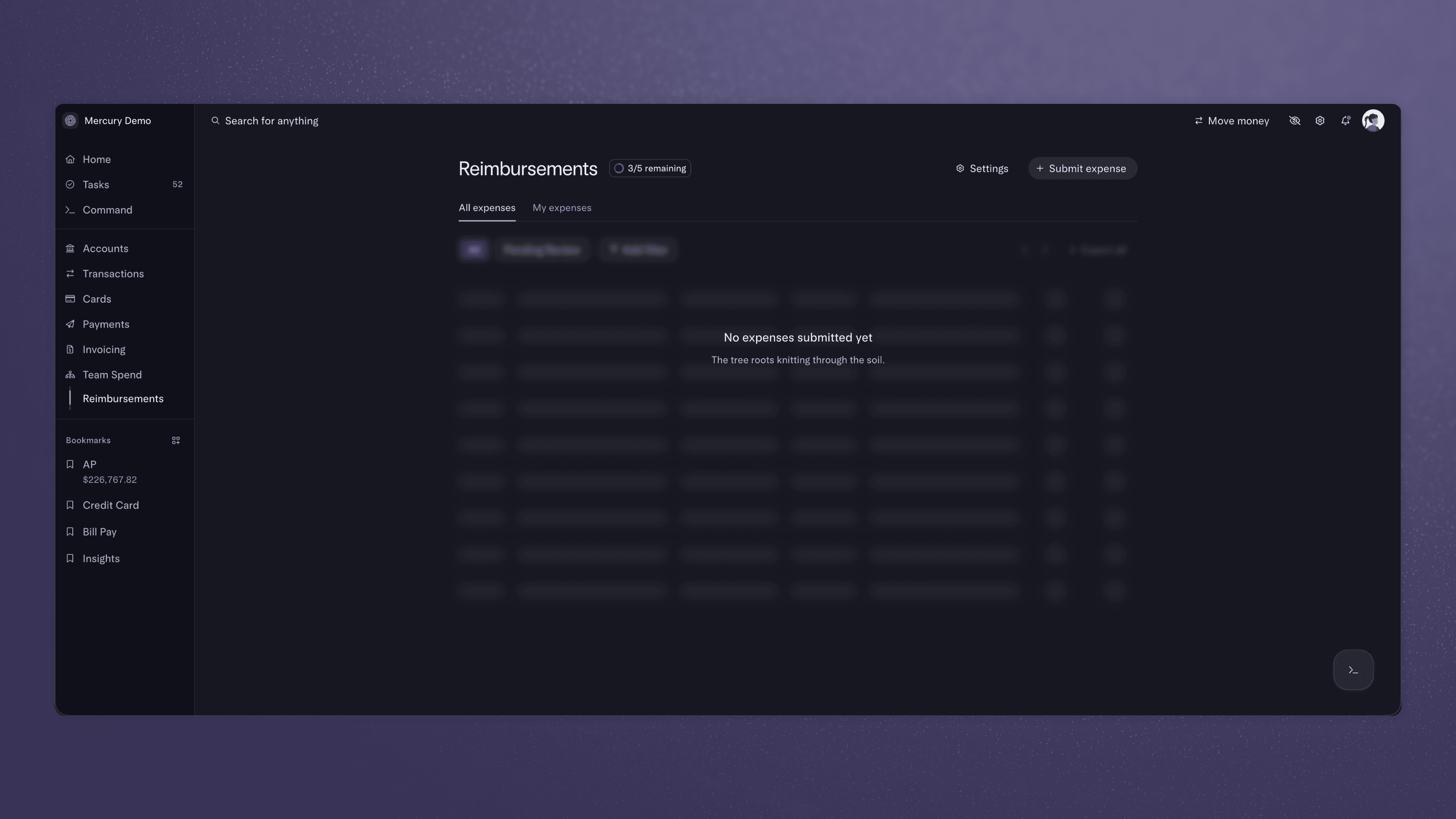
Looking at Mercury's empty states, they're straightforward but don't activate that many users. This prompted an exploration into new empty state designs focused on driving user activation.
PROCESS
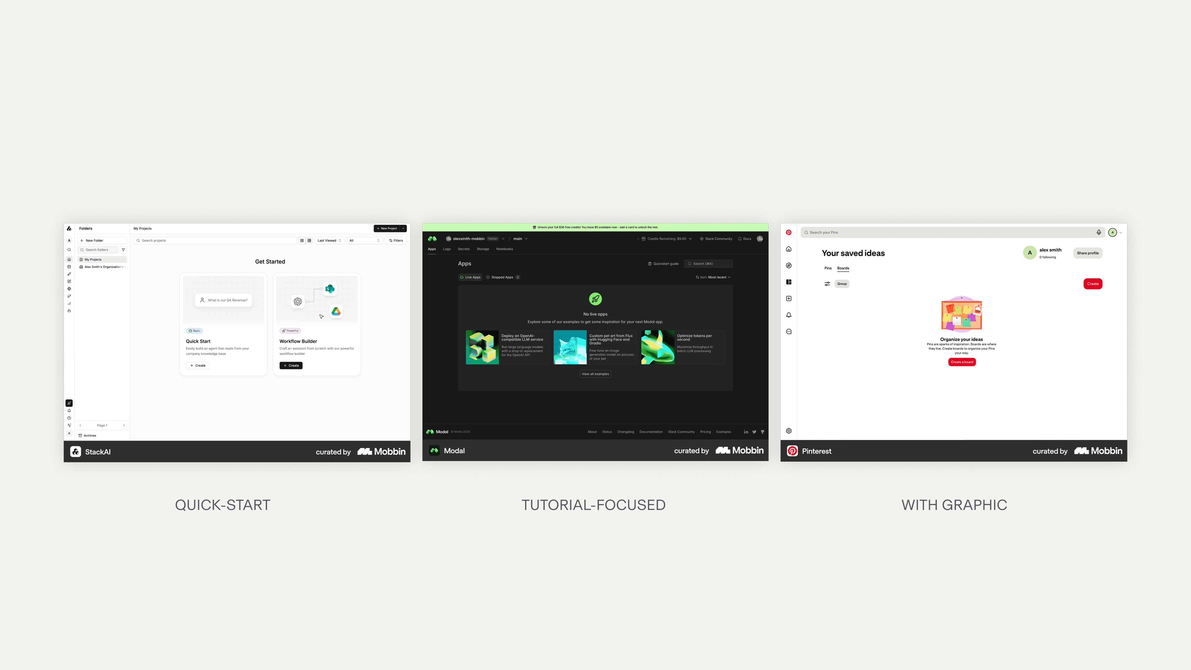
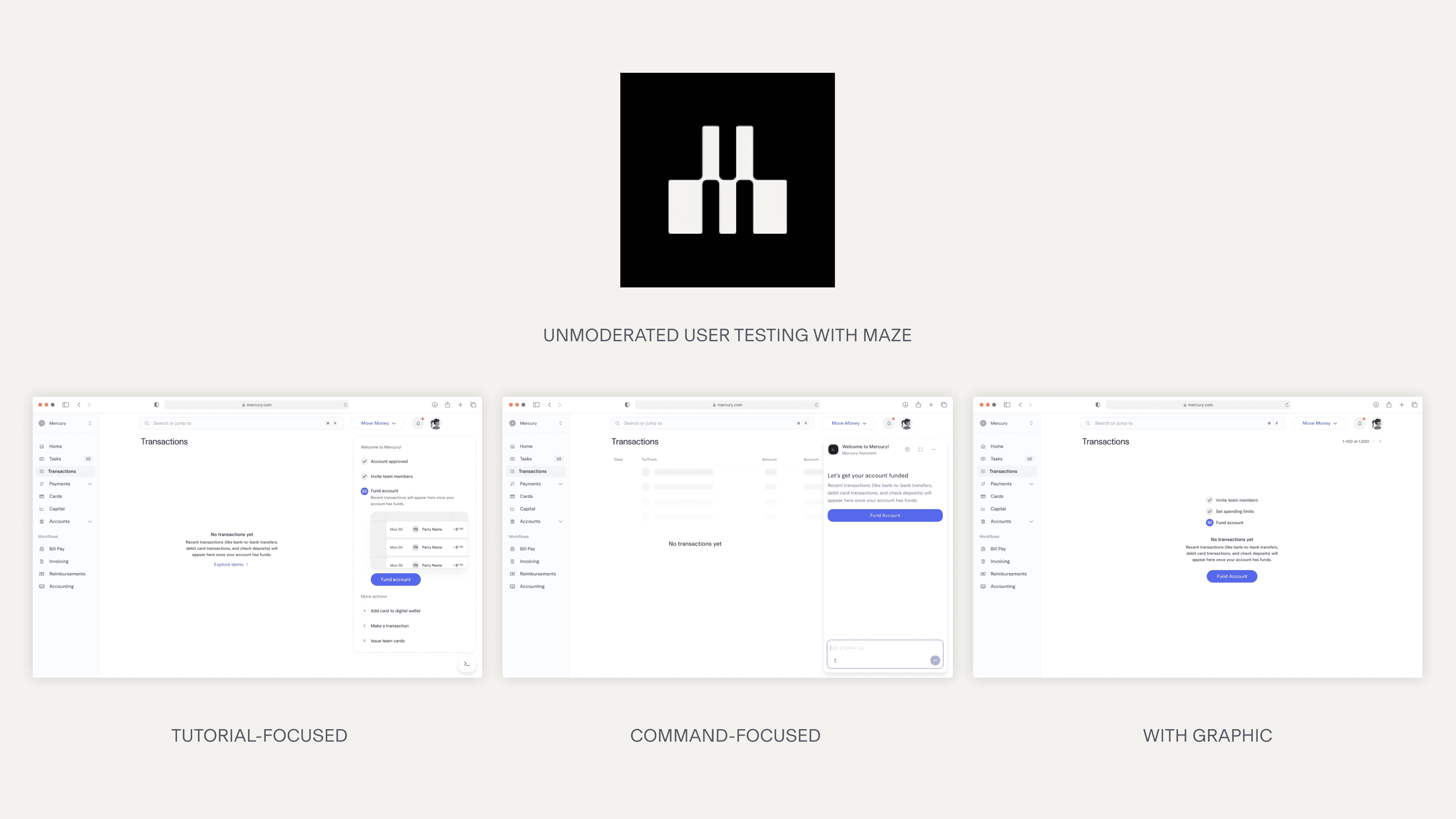
I begain with an audit, looking at 80+ empty state examples and driving common themes and patterns from them, helping me to think divergently about the new empty states. I took 3 promising concepts and conducted unmoderated testing using Maze.
DELIVERABLE 1
Users responded the best towards the design that added a simple graphic. Following this, I designed and shipped a new empty state for transactions.
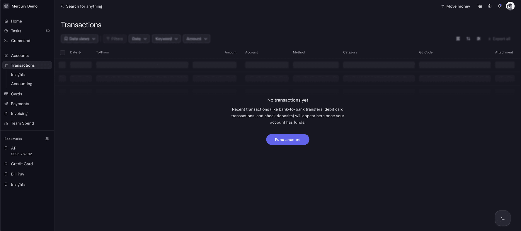
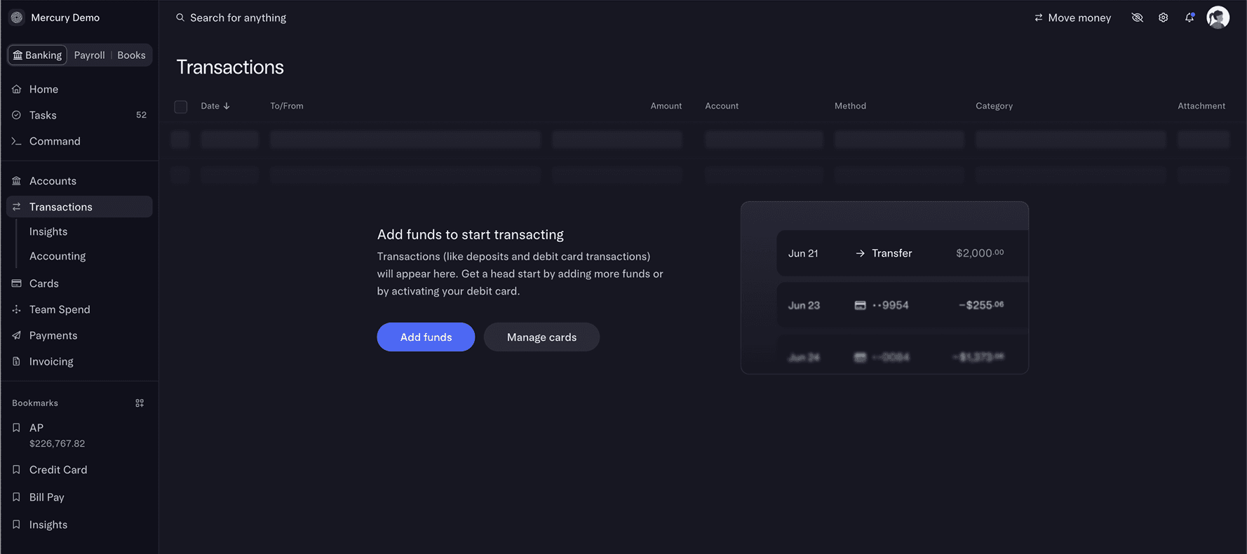
Refreshing treasury's empty state
The new empty state has a graphic that helps contextualize the page for users, and is horizontally split to keep the page tight and responsive.
INSIGHTS
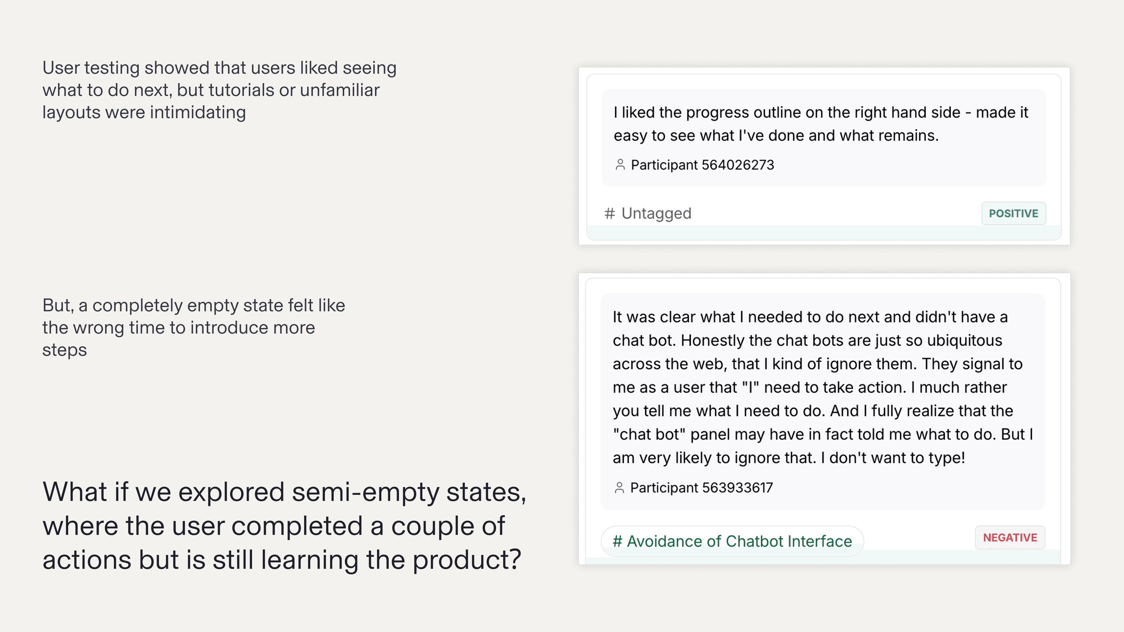
The unmoderated testing revealed that while the concepts, such as the tutorial or command focused framing would be helpful, they were not positioned effectively. A user seeing a to-do list right after onboarding and setting up an account lacks the context and understanding to fully engage with it.
DELIVERABLE 2
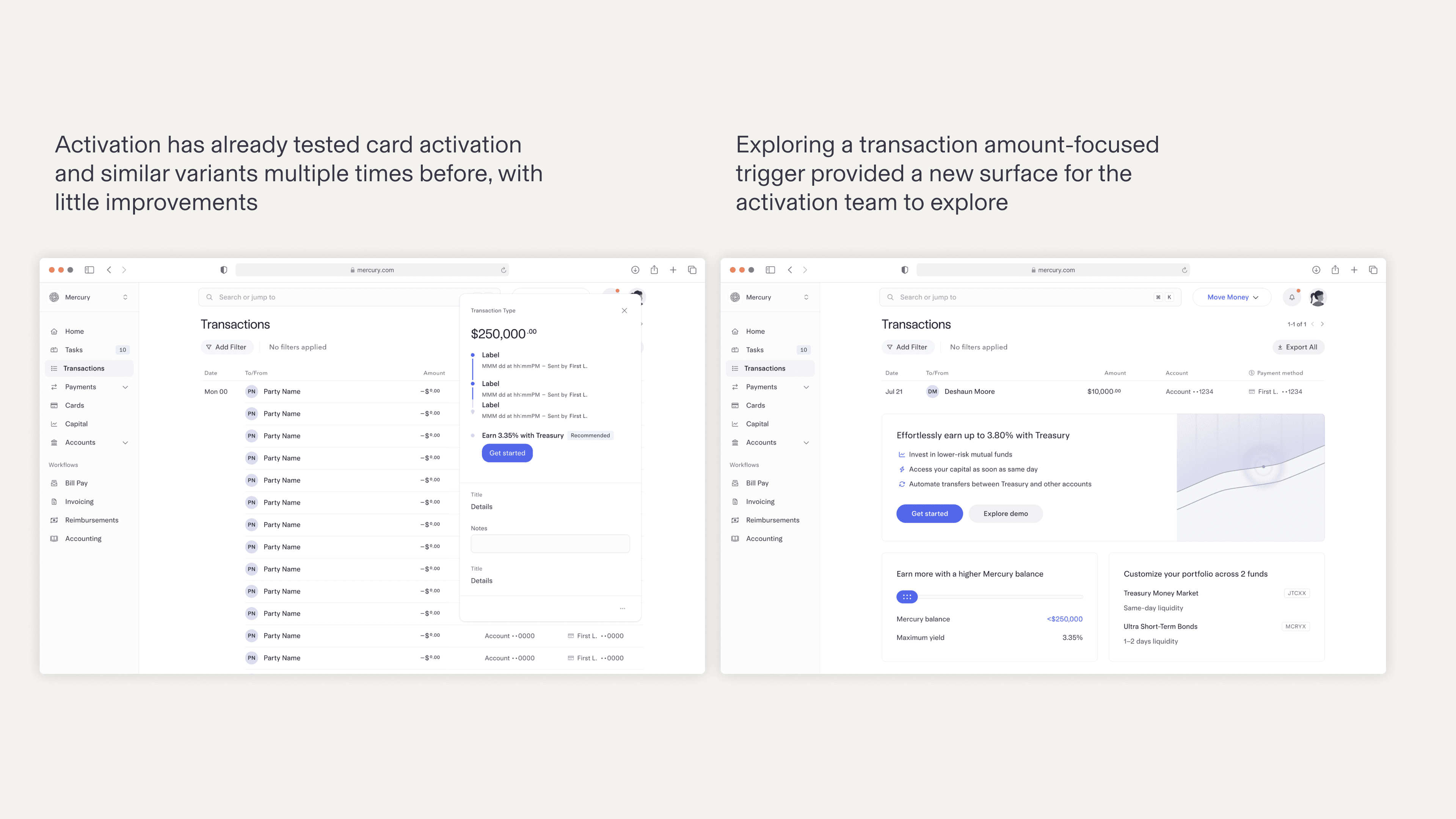
Landing on a treausy upsell, I explored a semi-empty state for the transacitons page. Users who are close to eligible for a treasuy account will see an upsell to open a treasury account. Users who are close to the minimum threshold will be prompted to add funds, and users who are eligible will see a CTA to open a treasury account.
A new layer for activation
Mercury currently doesn't have a footer banner pattern, so this design gives the activation team a new layer to work with.
Shipping the treasury upsell experiment
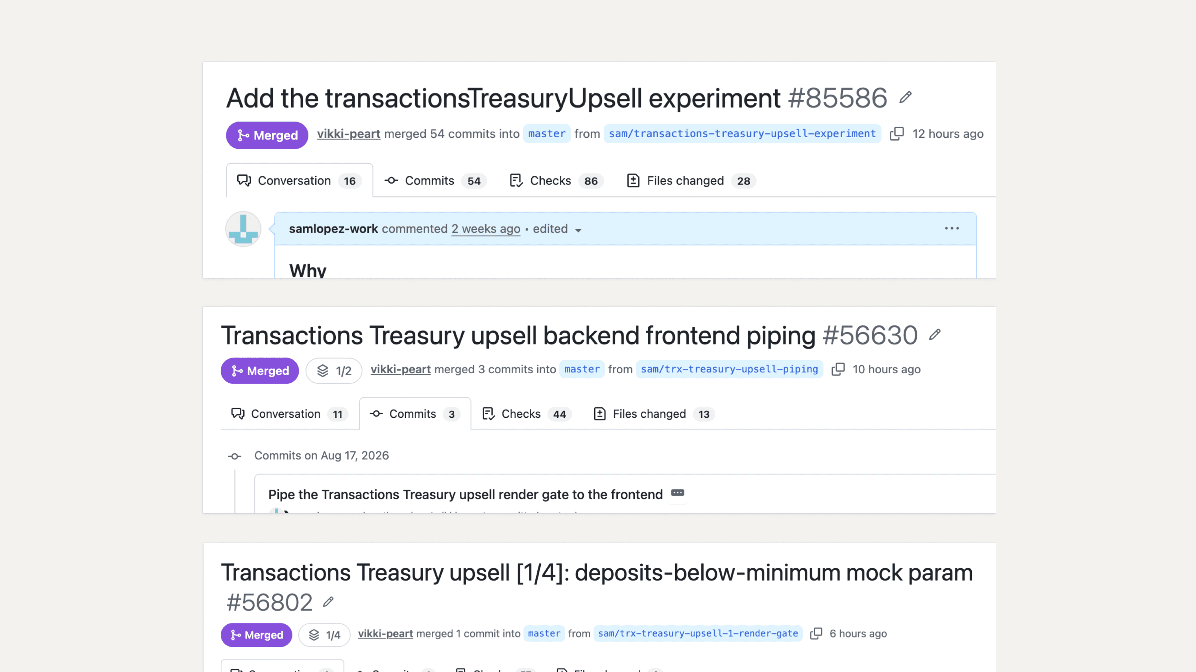
Using cursor, I coded the backend and frontend for the treasury upsell AB experiment to production, with help with my engineering partner.
AB Test Results
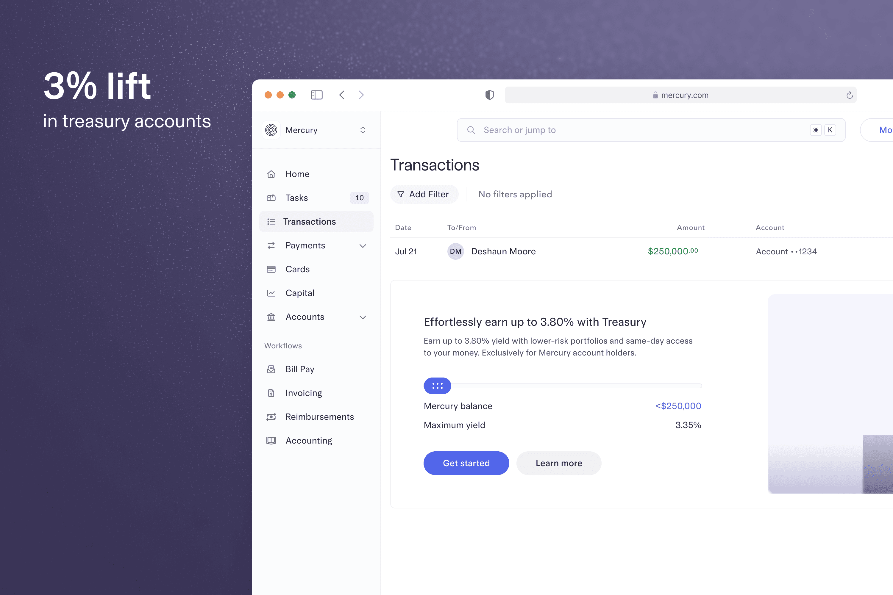
The treasury upsell saw a 3% increase in treasury application, which is a win for activation!
EXTRA
During my internship, I had the opportunity to explore new ways I could leverage AI in my design process, and had the opportunity to work on other side projects for Mercury.
I made a custom tool to help me quickly iterate adjust the design directly in the browser. The tool lets me adjust tokens and parameters, and create presets to compare. I can export the final draft as a text input to send back to my agent.
Exploring a feature upsell for Mercury budgets.